Articles

Linux font substitutions

In Uncategorized on 20/07/2010 by weirdfellow Tagged: , , , , ,

Most of the sites out there expect you to have Windows fonts. The layout is usually designed with those fonts and would break if you don’t have them.

Usually the designer is nice enough to include the sans-serif font at the end of the font definition in CSS, but two sans-serif fonts can be pretty different – Tahoma and Arial Black for instance.

It is also possible to install the msttcorefonts package and use the .fonts.conf from Ubuntu wiki, but I don’t really like this approach – Linux comes with a handful of nice fonts, why not to use them?

The most obvious choice for substitutions is the Liberation family – Liberation Serif for Times New Roman, Liberation Sans for Arial and Liberation Sans Mono for Courier New. But what to do with other fonts? Courier does look different too…

I have been playing with the script below (save it as .fonts.conf in /home/username directory) for a while now. Here is the result:

<?xml version='1.0'?>
<!DOCTYPE fontconfig SYSTEM 'fonts.dtd'>
<fontconfig>
<match target="pattern">
  <test compare="eq" name="family" qual="any"><string>Verdana</string></test>
  <edit binding="same" mode="prepend" name="family"><string>DejaVu Sans</string></edit>
</match> 

<match target="pattern">
  <test compare="eq" name="family" qual="any"><string>Arial Black</string></test>
  <edit binding="same" mode="prepend" name="family"><string>DejaVu Sans</string></edit>
  <edit mode="assign" name="weight"><double>200</double></edit>
</match>

<match target="font"> <!-- Switch off hinging for DejaVu Sans -->
  <test compare="eq" name="family" qual="any"><string>DejaVu Sans</string></test>
  <edit name="hinting" mode="assign"><bool>false</bool></edit>
</match>

<match target="pattern">
  <test compare="eq" name="family" qual="any"><string>Tahoma</string></test>
  <edit binding="same" mode="prepend" name="family"><string>Droid Sans</string></edit>
</match> 

<match target="pattern">
  <test compare="eq" name="family" qual="any"><string>Arial</string></test>
  <edit binding="same" mode="prepend" name="family"><string>Liberation Sans</string></edit>
</match>

<match target="pattern">
  <test compare="eq" name="family" qual="any"><string>Times New Roman</string></test>
  <edit binding="same" mode="prepend" name="family"><string>Liberation Serif</string></edit>
</match>

<match target="pattern">
  <test compare="eq" name="family" qual="any"><string>Georgia</string></test>
  <edit binding="same" mode="prepend" name="family"><string>Droid Serif</string></edit>
</match>

<match target="pattern">
  <test compare="eq" name="family" qual="any"><string>Impact</string></test>
  <edit binding="same" mode="prepend" name="family"><string>Droid Serif</string></edit>
  <edit mode="assign" name="weight"><double>200</double></edit>
</match>

<match target="pattern">
  <test compare="eq" name="family" qual="any"><string>Courier New</string></test>
  <edit binding="same" mode="prepend" name="family"><string>Nimbus Mono L</string></edit>
</match> 

<match target="pattern">
  <test compare="eq" name="family" qual="any"><string>Trebuchet MS</string></test>
  <edit binding="same" mode="prepend" name="family"><string>Linux Biolinum O</string></edit>
</match> 

<match target="pattern">
  <test compare="eq" name="family" qual="any"><string>Lucida Console</string></test>
  <edit binding="same" mode="prepend" name="family"><string>DejaVu Sans Mono</string></edit>
</match> 

<match target="pattern">
  <test compare="eq" name="family" qual="any"><string>Lucida Sans Unicode</string></test>
  <edit binding="same" mode="prepend" name="family"><string>DejaVu Sans</string></edit>
</match> 

<match target="pattern">
  <test compare="eq" name="family" qual="any"><string>Palatinio Linotype</string></test>
  <edit binding="same" mode="prepend" name="family"><string>URW Palladio L</string></edit>
</match> 

<match target="pattern">
  <test compare="eq" name="family" qual="any"><string>Consolas</string></test>
  <edit binding="same" mode="prepend" name="family"><string>Inconsolata</string></edit>
</match>
</fontconfig>

Liberation fonts are usually installed, but don’t forget to install Droid font family, Inconsolata and Libertine and Biolinum families.

I have also switched off the hinting for DejaVu Sans. It does not get correctly hinted with Polish letters – I guess not everyone will have this problem – the lines 15-18 could be removed in such case.

In the result I get something like that:

I am really happy with the result. How about you?

Articles

2 matchers expected, 1 recorded.

In Uncategorized on 15/07/2010 by weirdfellow Tagged: , , , ,

EasyMock is really a nice framework for mocking interfaces, so you can reliably test your classes.

As always – everything is fine, unless you need to do something more complex. As long as you know all parameters passed to the mocks, there are no problems. But sometimes it is not possible to predict all arguments the mock will receive. A bit of research and here it is:

  MyData myData = EasyMock.createNiceMock( MyData.class );
  MyService serviceMock = EasyMock.createMock( MyService.class );

  expect( serviceMock.doSth( EasyMock.<File>anyObject(), myData ).andReturn( true );

Seems OK – doesn’t it? The code tells serviceMock to expects a call to doSth method. The second argument should be myData object, while we don’t care about the first one.

Unfortunately, you will get something like that:

java.lang.IllegalStateException: 2 matchers expected, 1 recorded.
	at org.easymock.internal.ExpectedInvocation.createMissingMatchers(ExpectedInvocation.java:56)
	at org.easymock.internal.ExpectedInvocation.(ExpectedInvocation.java:48)
	at org.easymock.internal.ExpectedInvocation.(ExpectedInvocation.java:40)
	at org.easymock.internal.RecordState.invoke(RecordState.java:76)
	at org.easymock.internal.MockInvocationHandler.invoke(MockInvocationHandler.java:38)
	at org.easymock.internal.ObjectMethodsFilter.invoke(ObjectMethodsFilter.java:72)
	at org.easymock.classextension.internal.ClassProxyFactory$MockMethodInterceptor.intercept(ClassProxyFactory.java:93)

Unfortunately, it is not possible to mix values and matchers – a anyObject method is a matcher. To make the test execute correctly, all parameters should use matchers instead of just values. Solution is pretty straight forward – use eq matcher:

  expect( serviceMock.doSth( EasyMock.<File>anyObject(), EasyMock.eq( myData ) ).andReturn( true );

In addition to eq matcher, EasyMock does publish a handful of other matchers. Worth noting are aryEq for comparing the array contents and isA for checking the class of given object. The EasyMock site gives a full list of those.

Articles

Ubuntu Lucid and Compcache

In Uncategorized on 15/07/2010 by weirdfellow Tagged: , , ,

I have been very excited about memory compression for years. The performance boost achieved with Quarterdeck MagnaRAM on Windows 98 still brings smile on my face. Without memory compression my 64MB system sounded like it was chopping parsley – definitely there was some swapping. Switching MagnaRAM on kept it quiet (to be precise – it was loading the next level of Colin McRae Rally 2). Not to mention the difference in required time. Unfortunately, I couldn’t find similar tool for any Windows NT system.

Recently I started to build a development machine on Ubuntu Lucid Lynx and decided to give the Compcache a chance. Compilation caused me absolutely no problems – just download the package, unpack it and execute make. Although there are some patches for the kernel, so it can use the memory even more efficient, they are not required and Compcache will work with stock kernel. Compilation generates two things: a kernel module ramzswap.ko and a user-space utility rzscontrol.

It is pretty simple to initialize compressed swap disk by hand, but I wanted a slick and elegant integration with the services management subsystem. A couple of experiments and voila: my Upstart script for Compcache looks like that:

description "Initializes Compcache"

start on runlevel [2345]
stop on runlevel [!2345]

pre-start script
DIR=/usr/local/src/compcache-0.6.2
CONTROL=$DIR/sub-projects/rzscontrol/rzscontrol

# load dependency modules
modprobe lzo_compress
modprobe lzo_decompress

# load ramzswap module
insmod $DIR/ramzswap.ko num_devices=2
sleep 1s

# Initialize devices with 512MB upper limit.
# These devices does not have a backing swap.
$CONTROL /dev/ramzswap0 --disksize_kb=524288 --init
$CONTROL /dev/ramzswap1 --disksize_kb=524288 --init

# Switch the swaps on
swapon -p 5 /dev/ramzswap0
swapon -p 5 /dev/ramzswap1
end script

post-stop script
DIR=/usr/local/src/compcache-0.6.2
CONTROL=$DIR/sub-projects/rzscontrol/rzscontrol

swapoff /dev/ramzswap0
swapoff /dev/ramzswap1

$CONTROL /dev/ramzswap0 --reset
$CONTROL /dev/ramzswap1 --reset

rmmod ramzswap
end script

Update the paths, save the file as /etc/init/compcache.conf and restart your system. Your system should have two additional swap drives – 512MB each – already configured and switched on. Such configuration also enables switching Compcache off by using Upstart commands too.

In my environment Compcache achieved ~65% compression – 1GB of swapped pages would take approximately 350MB of memory. In result system can allocate 1.7GB and use only 1GB of physical memory without any sign of HDD swapping!

My setup uses two separate swapping devices in order to keep both of the CPU cores busy. If running on Quad Core CPU, it is beneficial to create four devices. Kernel utilizes them equally.

Some useful commands to track your swapping:

sudo swapon -s #displays active swap devices and their usage
sudo stop compcache #switches Compcache off.
sudo start compcache #switches Compcache on
sudo rzscontrol /dev/ramzswap0 --stats #displays the stats of the first swapping device.

I am running this environment for couple of days and I see only advantages. Give it a try!

Articles

Waiting for sound system to respond

In Uncategorized on 30/06/2010 by weirdfellow Tagged: , , ,

This error message is around with many Ubuntu enthusiasts since 9.10. User cannot change the volume level, CPU usage gets ridiculous and the fan sounds like a AH-64 Apache…

The solution is actually very simple

  1. Remove directory .pulse from your home folder
  2. Perform the logout – login cycle

Voila…

Articles

GDIpp

In Uncategorized on 29/06/2010 by weirdfellow Tagged: , , , ,

Last time I showed that there isn’t a thing not worth complaining. Fonts and their imperfection in Windows definitely are.

Apparently, I am not the only one… This issue must be especially annoying for people from Far East. Japanese or Chinese alphabets are very complex and the correct shape of glyphs is important. And some guys only bitched about ClearType, but actually decided to do something about it.

That’s how GDI++ started – a first attempt to replace the windows font rendering engine. The idea is simple – replace font related functions from windows gdi32 library with custom ones. Library injection, hooks and other weird things are involved, but in the end it works.

Unfortunately, the project isn’t developed anymore. But not only it showed that the problem might be addressed, but also how to do it. GDIpp started with the ideas derived from its predecessor and although still in version zero, is impressive.

Try it out – there are versions for x64 and x86 versions of Windows. Although minor problems with spacing between characters can be observed from time to time (the font metrics API is not replaced yet), but the overall impression is impressive! Finally nice glyphs in Windows!

Articles

Creature of habit

In Uncategorized on 27/06/2010 by weirdfellow Tagged: , , , , , ,

I honestly don’t remember how many times I tried switching to Linux as my main desktop OS. In the end, all the things I use a PC for are already there – browser, ssh client, rdp client, multimedia player, Eclipse etc. I could easily invent a few semi truthful reasons, but to be honest with ya, I didn’t like the way it looked. And the thing that kept me repelled most were fonts. The text didn’t look the same way it looked on Windows.

I think I owe you an explanation here – I get attached to my fonts. They are very important part of my life and I have managed to keep fonts on my desktop aligned with my idea of correct fonts for a very long time… Everything that was different was bad – how simple is that?

Windows 95, Windows 98 and 2000 defined the fonts. Windows XP has brought to the humanity the awful technology of ClearType, which fortunately could be kept off. No harm done. With Vista it wasn’t that easy – although one could still switch is off, some of the dialogs would persist on using ClearType. But there was escape route – the crowd around was shouting Vista sucks, so it was easy just to join them and keep my “Windows alike” fonts. When I think about it, I managed to keep same fonts for roughly 15 years!

So, on Linux desktop the fonts were always unevenly spaced, unfocused, blurry, chaotic etc. Pick your own. Trying to understand why the glyphs look different, I did a lot of reading. Hinting, BCI, subpixel rendering and subpixel positioning are the terms you mind find around the Web. And I have learned that there are two main camps out there when it comes to text rendering – Microsoft and Apple.

Microsoft – hard core hinters

Microsoft philosophy is to hint the glyphs very much, disturbing their shape, weight and width while make the glyphs appear as sharp as possible. Don’t get me wrong – it isn’t necessary a bad thing to do some tuning – in the end we are using screen displays and can expect the letters to be comfortable to read.

Unfortunately such approach encourages something ridiculous: designers would use typeface which is not designed for screen – like Arial – for content that is displayed on the screen only – like websites  – and expect the hinting to take care of the quality on the screen. It is so common, probably the first site your browser opened today already did that (google.com).

I am pretty sure most of you already know how it does look. Just in case:

It definitely looks sharp – but it does not look like Arial anymore! Arial isn’t that narrow and that tall.

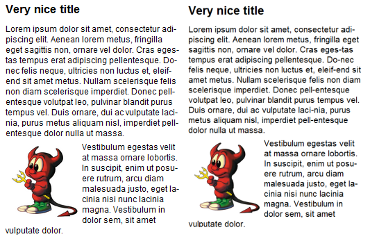
The situation gets even worse when you are using WYSIWYG applications. They require undisturbed text flow and would be nice if your printed page was as dark as you can see it on the screen. I don’t want to dig into that, but just compare the two paragraphs below. The left one is rendered in standard 96dpi, the right one in 166dpi (zoomed 2x) and then sized down to 58%. Notice how differently the text gets wrapped. The carefully placed hyphenation got damaged! 

I know – newer APIs shipped with Vista and Seven do not hint fonts at all. But majority of applications on Windows will use old GDI and have hinted fonts. Word 2007 does that too.

Apple – it has to be pretty

Apple has philosophy of rendering the glyphs on the screen as close as possible to their shape. This means no hinting at all. For users used to the Windows approach, the resulting text might seems a bit blurry, dirty, even difficult to read (ask Mac users, they will not find anything wrong about it – you just get used to it).

If you like it or not, the facts are that the glyphs on screen look like they were designed. It also eliminates most of the problems in WYSIWYG editors – your print will look exactly the same the text looked on the screen.

If you use Windows and want to test yourself how the text on MacOSX looks like, install Safari, open the preferences dialog (CTRL+,) and switch the font rendering method.

Vertical hinting?

Both approaches are contradictory. It seems that it is impossible to have sharp fonts without losing the overall feeling of the text. Fortunately, there something to be don. Very comprehensive article Texts Rasterization Exposures gives a lot of suggestions how to improve the font rendering accuracy while maintaining the clearness and crispiness.

Most of them are not widely implemented, but fortunately there is FreeType2 library. It’s autohinting module is capable of vertical hinting only. I haven’t seen any Windows application that would utilize it, but on Linux desktop (I have been testing Mint Linux 9, a flavor of Ubuntu 10.04) both Chrome and Firefox utilize this feature. And it works great! Have a look yourself…

Isn’t it a huge improvement from Safari rendering? And almost nothing lost – just fraction of pixel in vertical positioning!

Keep in mind that this is rendered with Arial – typeface not suitable for screen. Below the same text, with Arial replaced with Liberation Sans – a totally free typeface that introduces the same metrics, but in my humble opinion looks better on the screen.

From now on, this defines the fonts I would like to have on my desktop…

Petition

I, a creature of habit, who kept his fonts virtually unchanged for over a decade, would like to sign the petition to developers.

Use the vertical hinting!

It gives it all – the advantages of not hinting (undisturbed text flow, correct glyph shapes and accurate feeling of grayness of the text) while maintaining high contrast.

Strangely enough, Chrome for Windows uses some hacks to use standard Windows GDI font rendering instead of FreeType2. Chromium developers (and Firefox guys too) – how difficult would it be to allow user to select which font rendering method he prefers and give users the freedom of switching between GDI and FreeType2?

I can also think about a fancy font preference screen, that would allow user to define font substitution. In result particular desktop could display more suitable font than Arial, when this is defined in the site stylesheet.

technology of